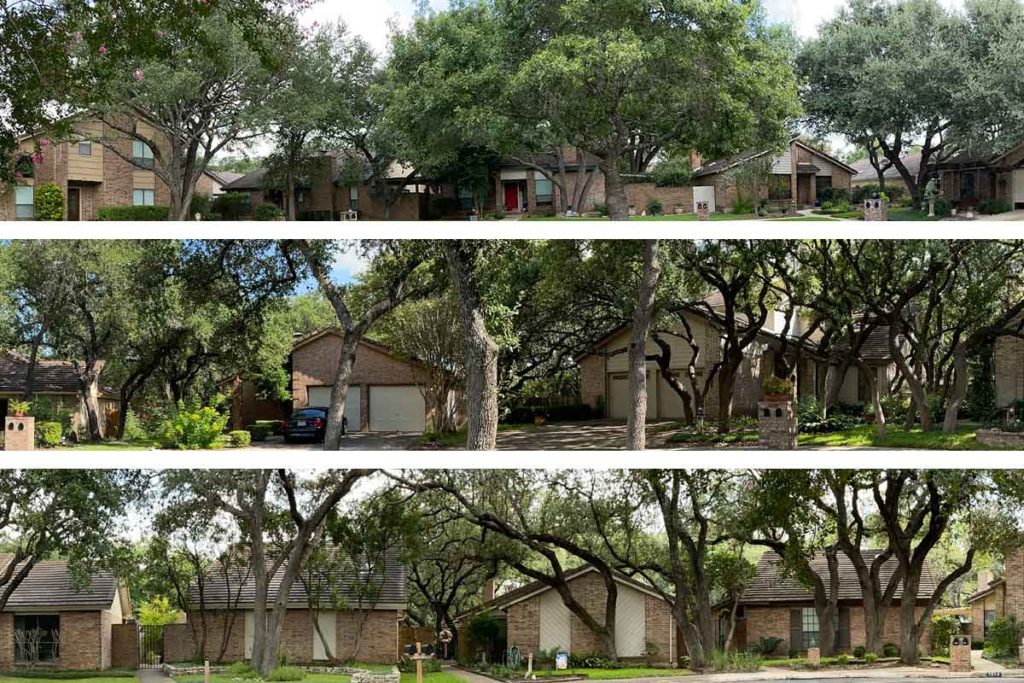
The Design Guidelines specifies the use of “color that preserves the architectural integrity of the neighborhood”. Reading that statement got me thinking about why color matters. Color has been in interest of mine, even before I took up painting after retirement.
In a painting, color harmony is absolutely essential to creating aesthetically pleasing art. In a planned community, such as our Gardens of Oak Hollow, the whole community as one large “work of art”. Just as an artist creates color harmony across an entire canvas, our original architects creates color harmony throughout the whole community.
Color harmony is a series of colors that work well together. For artists color harmony is discussed with a color wheel constructed around the three primary colors (reds, yellows, and blues) that cannot be mixed from any other colors. Other colors are created with mixtures of the primary colors. For example, orange is a mixture of red and yellow and green is a mixture of blue and yellow.
Brown is a mixture of all three primary colors. A wide variety of browns can be created shifting the proportion of each primary. So the color “brown” has many wonderful variations.

The color “brown” expands further with shades, tints, and tones. Without going into great depth, “shades” are created by adding black to the original color; “tints” are created when white is added; and “tones” are created by adding grey. In looking around our community, the main color appears to be brown.
So the Work of Art that the designers of the Gardens of Oak Hollow created is a beautiful, highly layered color scheme using only a few colors but a variety of shades, tints, and tones.
The end result is the beautiful community we all love.


